Kill Bill Poster Analysis

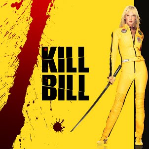
- This is a theatrical poster for the first volume of the duology. Instantly, the first noticeable characteristic is the colour scheme. Red, yellow, and black, are nature’s “warning colours”. We see them on insects, animals, plants, and fire; all these things might pose a threat. A person’s eye is therefore drawn to the poster with intrigue and wariness.
- The characters direct mode of address is also intimidating, and her solitude suggests she is central to the plot. These are used to attract and excite a potential audience who might enjoy the thrill of dangerous exploit. In addition, the juxtaposition of the yellow and black is striking and bold. The yellow might also be a reference to the post-femininity of the film, and the ‘blonde’ stereotype broken by the lead actress. It could too arguably be an ironic twist on the happiness and cheeriness culturally implied by the vivid yellow. The style later becomes absolutely iconic to the series.
- The blood on the poster is an unmistakable code: this film will be bloody. True to this conjecture, the films have been described as “the most violent ever made”. An audience with specific interest in gory or high-octane films will now already be interested. This would typically be a more masculine interest, and this masculine appeal is further affirmed by the ‘sexy’ depiction of Uma Thurman, the lead actress in the films.
- Continuing with the black and yellow theme, the tight-fitting and part-unzipped racing suit is both a symbol of her female carnality and her solidarity. The badges give her an almost petrol-head image which is yet another appealing factor for a potential male audience.
- The typography of the title is heavy-duty and outstanding. Again, it is black and in contrast to the prevailing yellow all around it. The title itself is actually perceptibly strong. They are two similar, and rhyming, words that resound in the viewer’s head. Perhaps this is because of the sinister nature of the word ‘KILL’ and the seeming impotence and normality of the name ‘BILL’.
- Another recurring theme in the poster is the cutting or slashing. The samurai sword in the character’s hand is another enigma code. The audience is instantly wondering what she is going to do with the sword and crucially, who she is going to do it to. The audience’s suspicions are confirmed in the title, which implies, of course, that her target is ‘Bill’. However, the audience is then left wondering who Bill is, and why she is intent on causing him harm.
There are slashes through the title itself, and a similarly shaped blood spatter, indicating that swords and their use as an offensive weapon will be central to the story line. It is arguable, too, that the sword is also symbolic in other ways. From a Freudian perspective, a sword is a phallic, sexual symbol and a figure of masculinity. Also, in Chinese symbolism, a woman drawing a sword is suggestive of childbirth. Tarantino is well-known to have a special interest in Asian culture and arts, and a crucial trigger to the plotline is the retrieval of the central character’s new-born child.
No comments:
Post a Comment